Thursday 21 November 2013
Feedback from presenting my animation;
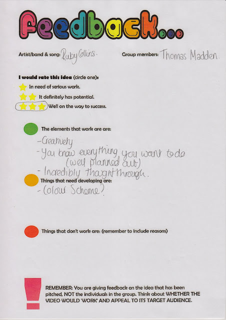
From presenting my
animation, I received feedback, which would allow me to progressed in the
future making amendments to the less successful parts in the project and
highlighting the successful parts. It was quite constructive feedback.
Overall from the feedback
the parts that everyone thought worked really well were the locations, the
scene, links between the visuals, and the organic nature from the outdoors.
They also liked the flow and transition from one scene to the next as well as
the less rehearsed nature of the video to make it fit the genre.
Unfortunately though, there
were picky critics that thought that one more location added to the music video
would have made it more successful. They also picked up that there was no
notion of looking, but when they deliberated over this it was clear, they were
in fact wrong, as there was a mirror scene that adopted this.
The critical people also
thought that one more location was needed so that I ensured that the music
video was not too repetitive, as you have to try and make the video have
multiple views. I’m not sure if this though works on my music video, as I want
it to revolve around the singing more then what is actually happening in the
video.
The other comment they made
was that from the last ten frames of the storyboard it was unclear as to what
was actually happening, once I explained the idea; that it was almost Ruby
Collins running to show she was free and having a good time, they understood
the action. I did though apologize for the last few drawings, as 100 drawings
on my own in five days is harder then split by three people.
In terms of following the
Goodwin principles set, I did to an extent. I just chose to avoid the
intertextual referencing. From this feedback I will make the changes and the
corrections to make the audience happier.
Chat with Leanne;
This is my feedback session
that I had to have with Leanne. We got to discuss many things but predominantly
the main focus of this talk and chat was to talk about how Goodwin will
influence me with my music video and to the think how possibly Goodwin did not
have to influence me with certain things that he thought about in his approach
to a conventional music video. I like the fact that I got to chat to Leanne in detail
about my decisions but I do think that I need to still clear some things.
Leanne and me first of all
discussed all of the features that are evident in music videos that
Goodwin found. To begin with, I told her all of the principles that I followed
with examples such as the link between lyrics and music and the link between
visuals and music. My first clear link between the visuals and the lyrics is
the lyric; “girl put your records on” followed by a record player getting put
on and an iPod being plugged in.
The only thing that I thought
that I should not follow that Goodwin found was an intertextual reference and
this is because they are generally hard to find for my genre. When speaking to
Leanne she said that I should try and possibly think of something that could be
reference; whether this is a film, a show or another artist. When speaking to
Leanne I found that I could possibly link an icon in the Jazz industry such as Ella
Fitzgerald. This could mean a certain hairdo or a prop that would be reflective
of her character.
Other than this Leanne said
that she was happy with my current progress and the look of my correct project.
As a result of this meeting I will now make improvements to the project that I am
making. I hope that this makes my project better; I will post in the upcoming
weeks.
Wednesday 20 November 2013
Animatc
Above I have created
an animatic of the music video that I am creating for this project. I have
completed this animatic from the storyboards that I have created so that I can
present this to my class and find out if they like the idea of my music video
and find some changes that they can suggest to make the video more successful.
The process of making the animatic was quite time consuming and this was
because I had to keep cutting each individual image so that it fit the lyrics.
I also chose to scan in each storyboard and then crop the image and this was
because I wanted the audience who judge it to see a better quality scanned
image then a photograph.
I am quite happy with the
way it has turned out, but I do think that from watching the video that the
class could be very picky and possibly be judgmental about the last 10 drawings
as they are very basic although, I do think that the first set of drawings will
compensate for the others.
I hope to from this, now
present it to the class and get some feedback on the concept of my video,
seeing where it could be improved and notice what works well in the video.
Tuesday 19 November 2013
Starting to consider Print advert:
Mock Up Design 1-


 I think that the overall
successes of making this mock-up design have to be that the design follows
conventions of posters such as the name, a main image, a date and the record
label. I have also put a star rating on there as I think that this will show that
the star is credible and hopefully make people buy into her image and her
originality as an artist. The reason that I put the "telegraph" on
there is because generally critics that are recognized in the business work for
broadsheet newspapers.
I think that the overall
successes of making this mock-up design have to be that the design follows
conventions of posters such as the name, a main image, a date and the record
label. I have also put a star rating on there as I think that this will show that
the star is credible and hopefully make people buy into her image and her
originality as an artist. The reason that I put the "telegraph" on
there is because generally critics that are recognized in the business work for
broadsheet newspapers.
 To make the design more
successful and to improve the overall image I hope to play around with colour
composition, positioning and layers that could be added, but overall I am
content with the progress of the design so far.
To make the design more
successful and to improve the overall image I hope to play around with colour
composition, positioning and layers that could be added, but overall I am
content with the progress of the design so far.Monday 18 November 2013
Ellie Golding- Print Advert analysis
Above as you can see I have created a video on Final Cut Pro that discusses the key codes and conventions of a print based advert of a digi-pak for Ellie Golding.
Tuesday 5 November 2013
Annotating the Lyrics
Annotating the lyrics:
I have as you can see annotated the lyrics for my digi-pak and have critiqued what would accompany each lyric. I think this is crucial as it will help me to storyboard the music video allowing me to see what locations would work, where in the song the animation will stop. From my critiquing of the lyrics I plan on doing the storyboard as it will allow me to try and see what sort of image will work well at the point in the video. The successes are my detailed plan. Though, i do think that when i begin to storyboard i need to keep in mind that some of the comments are more valuable then the others, thus my storyboard should be reflective of each comments importance.
I have as you can see annotated the lyrics for my digi-pak and have critiqued what would accompany each lyric. I think this is crucial as it will help me to storyboard the music video allowing me to see what locations would work, where in the song the animation will stop. From my critiquing of the lyrics I plan on doing the storyboard as it will allow me to try and see what sort of image will work well at the point in the video. The successes are my detailed plan. Though, i do think that when i begin to storyboard i need to keep in mind that some of the comments are more valuable then the others, thus my storyboard should be reflective of each comments importance.
6 Panel Digi-pak :

This is my new and improved 6-anel digi-pak and although this is once again just another mock-up, it has allowed to start and see what my digi-pak may end up looking like after all the work has gone in. T he process of this mock-up six panel digi-pak was very time-consuming and don't get me wrong this is not completely finished but it has really allowed me to see where my digi-pak may end up.
I think the neutral colour at the back is very beautiful and far less annoying then a design that was on a blank canvas. In terms of the overall feel of the outcome i am pleased and this is because it has further my thumbnail sketches that i did a couple weeks ago. There are though some features that need to be worked upon such as turning the CD's around and then putting a background design on the panel. I think that, that would beincredible as it would almost be a finished mock-up design one in which i can be proud of.
The one thing i do have top critic from this design is the blandness of the three panels and this is because there are not that many layers there thus, meaning the panels are almost empty. Therefore, my next task should be to improve that and get some new images and drawings onto the design as it would enhance this design and thus allow for me to create a more prepared digi-pak in the future.
Monday 4 November 2013
Journal Post 04/11/2013
So far I have got a lot of feedback for my digi-pak and with this feedback I plan to improve my digi-pak by introducing colour and making my 6-panel digi-pak this week. This will allow me to have a more cohesive campaign and improve the digi-pak by seeing what is lacklustre. Such as improving certain images etc.
I also plan to now to try and storyboard all of my music video before this week is after and this is because I need to make sure that my music video is planned. This will help me to know where my project stands and how it can be improved.
I will also keep my blog updated so that I know that my blog is up to date with everything that I have completed.
Results from my speech
Generally people thought that my current progress with my digi-pak was good and that was because I received 3 stars from 9 out of the 10 asked to fill in feedback forms (one avoided the star rating). I think the feedback was honest and even if I don't agree with some feedback I have to be respectful of peoples opinions toward my progress.
I was completely in acceptance with one comment made that I should use watercolours to add colour to the front panel and as you would have seen from my blog I have already considered this. Therefore, I was very happy to hear that someone agreed with me, without me saying it directly. Other comments that I agreed with included re-shooting the images. Obviously, this comment in some respect is irrelevant as my digi-pak currently is a "mock-up" design meaning that it will changed anyway and the images will be retaken so I appreciate the comment but this is already going to be rectified.
There was though one comment I did not understand. Someone said that my digi-pak covers name was not understandable. Possibly I was not clear enough in my speech about why I used the random name. The name is "Swaying Rust" and this was because I wanted to apply personification to rust because rust is very earthy and organic and swaying is very natural. Meaning the name has a tone I can imagine a jazz artist singing about because it is not superficial. It also juxtaposed the neat font which is interesting. Moreover, without sounding unappreciative of this feedback, I will not be considering the judgement as I feel its acceptable. Though, if this is consistently questioned I am happy to re-consider the name.
The positive feedback included: a great overall essence, good consideration of the record label, a thorough presentation, good decision in font, nice carbon prints and acoustic CD was a successful idea. As I know that the audience feel these ideas are successful I plan to now and try flourish these ideas.


Digi-Pak Speech:
Analysis
Below are the media platforms in which make up the Pitch in which I plan on showing my media class. I have created a final cut Pro Video, a PowerPoint presentation and a photo. I don't think that I need notes to do the presentation and this is because at the moment I am very confident with the route I am going down and know exactly what has happened. I purposely left some of the slides with only images as I think less written information on the slides is better as instead the Class should listen to me rather then read.
I plan to show the video first to captivate the class and show my initial ideas, then I plan to show my presentation and then I want to probe discussion over my new and improved album cover for my digi-pak. I plan on updating my blog with a post that exemplifies the positives and constructive criticisms that are given as a result of the presentation.
Below are the components to my speech:

Design 2 - Digi-pak Front cover:

So as you can see from above, I have created a more professional digi-pak cover for my artist Ruby Collins and this was because the previous digi-pak cover that I completed online was unfortunately unprofessional. Though, it explore what I wanted it to, it had no refinement- this though was down to creating the album cover on an online application that allowed minimal control.
I have no rectified my mistake of using the online Photoshop application and instead used Photoshop Elements 10 which has in turn been a great executive decision as I can now upload my font, move the boxes, re-position images, contrast the lightness, add more images and overall get a more sophisticated approach. Clearly though this was another outcome not a resolution and this is because I am pitching my current progress to the class to see if the current route I am going down is successful and coherent.
Personally, I am very proud of this outcome and this is because it is a step up from what I have created previously and it has a far more refined air about it. This is especially because I have now considered adding the conventional platforms expected on a digi-pak such as the record label, the album cover and the sticker. I think though to improve this outcome I need to now create the whole 6-panel mock-up design and work that way forward so I can see it all. I will also act on any feedback that is given to me from the presentation
Sunday 3 November 2013
Thinking of a name for my digi-pak:
Digi-pak names;
I have below as you can see started to brainstorm some ideas for the name of the digi-pak. This was quite difficult to do as it is hard to make a catchy name up straight away. Though, I do think their are potentially good titles below. I do think that latching onto the season is a good idea and this is because it holds onto something which is organic, natural and an uncontrollable thing that cannot be seen as superficial or man manipulated.
I do think though that the outcomes that included the seasons were quite cliché and did not have that edge or appealing factor that I intended I think the most successful outcome had to be the outcomes that featured the metaphorical expression including "Swaying grass" and "swaying rust". I love the personification of Swaying Rust and this is because it is catchy and makes me want to explore the album. It will also contradict and juxtapose the neat and fancy handwritten typography that accompanies it which could be interesting.

Below are my shortlisted digi-pak names:
Autumn Madness
Autumn Love
Endless Autumn
Endless Desire
Rustic Autumn
Rushed Mess
Winters Near
Inherited wonder
Sumer Brush
Feel good
Crushed Leaf
Swaying Rust
Swaying Grass
I have below as you can see started to brainstorm some ideas for the name of the digi-pak. This was quite difficult to do as it is hard to make a catchy name up straight away. Though, I do think their are potentially good titles below. I do think that latching onto the season is a good idea and this is because it holds onto something which is organic, natural and an uncontrollable thing that cannot be seen as superficial or man manipulated.
I do think though that the outcomes that included the seasons were quite cliché and did not have that edge or appealing factor that I intended I think the most successful outcome had to be the outcomes that featured the metaphorical expression including "Swaying grass" and "swaying rust". I love the personification of Swaying Rust and this is because it is catchy and makes me want to explore the album. It will also contradict and juxtapose the neat and fancy handwritten typography that accompanies it which could be interesting.
Below are my shortlisted digi-pak names:
Autumn Madness
Autumn Love
Endless Autumn
Endless Desire
Rustic Autumn
Rushed Mess
Winters Near
Inherited wonder
Sumer Brush
Feel good
Crushed Leaf
Swaying Rust
Swaying Grass
Progressing the mock up design of my digi-pak:

I have here as you can see started to work on the front cover, sadly though I could not refine this that much. This is because I don't have Photoshop thus used an online application I will though in the morning put this all together and make it much better and this is because Photoshop allows me to make the outcome refined.
I have planned to when I go to school tomorrow with all of the images and the mock-up images that I have taken to start and put them all on Photoshop ready t start o make a mock up design. This will allow me to make the cover more professional. Obviously, this won't be the best outcome or the finished product but I can keep switching layers endlessly to make the cover better.
The success though of using this on the online programme was to progress my design that ii made in the first place. I think overall the design and everything will work well. What I plan to change is making the sticker on the front cover more clean and refine, to add watercolour t half of the face and to make the artist name larger. I also plan to contrast the light and to add a digi-pak name which I need to think about.
Track Listing
Picking My Track Listing:
I am no deciding the track listing for my digi-pak. it is essential that I thoroughly research the songs and make sure that they are from the same genre and they all have the same tone and feel-good factor that the single I have chosen for my music video has. This is because my digi-pak should have a continuous vibe that suggests the artist is cohesive.
Norah Jones- Don't know why?
Beyoncé- Wishing on a star - Although Beyoncé is mainstream, this song has the same vibe which is feel good factor with a quite dance vibe.
Corinne Rae Bailey - Closer
Ella Fitzgerald - Summertime
Vanessa Carlton - A Thousand Miles
Florence and the Machine- You got the Love- Once again although the song is quite a appealing to a large demographic, it has a very organic vibe that can be enhanced by new vocals.
James Blunt- You're Beautiful- Although this song is originally sang by a man, I think the vocals and the overall vibe would be interesting for a females voice.
Florence and the machine- Lover to lover- features very natural vocals and correlates with the outdoor vibe.
Corinne Rae Bailey - Put your Records on - The single I have chosen to do my music video for.
Norah Jones - Come away with me
Above is the list in which I have chosen to put on my digi-pak.
Subscribe to:
Posts (Atom)