Showing posts with label Production. Show all posts

Wednesday, 5 March 2014

Sourcing extra feedback

Social Networks

I decided that now that I have completed my media project that I would send out some questions through social networks in hope that people would respond. Ad you can see from previous updates and posts I have placed some items on Flickr, though I thought to relish feedback even more for my evaluation I could try some new methods. This included sending out E-mails to my friends and tweets on twitter. As I don't have Facebook, that site was not an option.

Email-

I decided to e-mail a range of contacts that I have on my e-mail with the link to my music video to see that if I could get some more feedback on my music video. Although, I only received detailed feedback from one person it proved worth while posting this on my e-mail and getting the feedback. The feedback was as follows:


I was very happy with this feedback, as it understood why I used the creative flare, the smooth transitions from painting to video footage etc.


Twitter-

I also published a tweet on my twitter account to get people to give some feedback, this also received some feedback commenting on the professional appeal off the video. I was very happy with the feedback as the whole point of the project is trying to emulate what the music industry create in music videos on a smaller level. Which I think that this feedback deciphers.

Tuesday, 14 January 2014

Finished Digi-pak Design-


Digi- pak finished design -

This is my current finished Digi-pak design; I have as you can see a conventional six panel structure accompanied by two CD designs too. I quite proud of this design, as the designs look well considered and because once I had put the six panel design and the CD designs on the white blank background, it actually looked really professional for a project curriculum based.

The successful parts about this digi-pak have to be the thought into the way that the consumer sees the product; by this I mean the consumer will see this product as a considered product that has been thought throughout the process of making. Including the bleak colour scheme in the inside three panels, the bright colours of the CD's that conflict the bleak colour scheme and the bright colours of the front two panels as they are fundamental to catch attention.

As well as the cropped technique applied using Photoshop tools to give the urban ground rooted feel about the design as it is assisted by the black and white colour scheme. This colour scheme works well with the design because even though the exposure and the colour changes, they are of a similar palette, so still follow on from another. The other success of this design has to be all of the digi-pak conventions have been considered including: the record labelling, the photos, copyright information, the inside leaflet design, the barcode, album name, artist name, promotional deals and social media contact detail.

I think I will only improve this design once the first screening is over, as I feel that my view is only my view so ultimately I am quite bias to making the design, so new ideas should come from the people in my class going through the same procedure instead of me.

Accoustic CD design-

Description of the design-

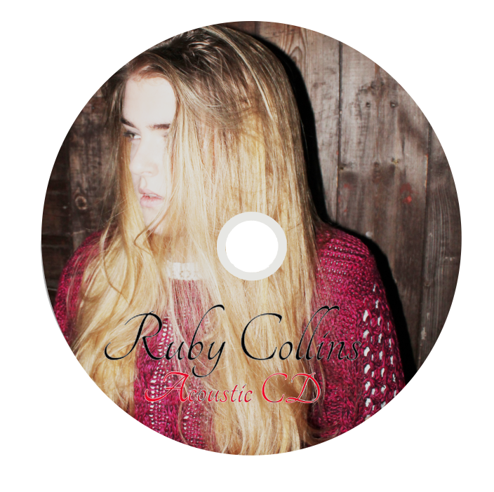
After completing my digi-pak quite some time ago, I thought that it was time for me to now think about how I could progress my design and make my digi-pak as good as it possibly could be. In order for me to make the overall design very coherent I thought that I should look at the small details in the digi-pak, this happened to bee the CD design. So, I decided that I would make two CD designs and then add them to my digi-pak. To make this design, from  my test shots that I completed quite a while ago, I selected an image of Ruby Collins (Lauren) posing then, to make the design more considered I played with brightness and exposure contrast controls so that the design looked well lit; as this is a convention of feel good jazz and pop.

What is successful about this  CD design?

I think that the positioning of the text as well as the font works really well on the design as it stands out and the colours are all of a similar palette meaning that it has a coherent colour scheme and style. I think the curvy writing also is quite conventional of this genre of music as it has quite a controlled refined nature about it. I also feel that refining the design even more would be quite difficult, not becaasue I think my designs are amazing, but because I think it will distract from the rooted vibe.

CD cover -


This is my main CD design, after looking at my digi-pak design I noticed that there are many changes that could be made to my digipak to try and make it more coherent. One of theses changes included trying to make sure every detail is completed; so I have started to make a CD for my digi-pak.

To make this design, I had to try and find an image that I thought represented the understated light heart nature of the music that accompanies the digi-pak and when looking I selected the above image. I thought because this image was so laid back and "cutesy" it could give of the impression that Ruby Collins' doesn't take herself extremely serious and that it's alright to be happy and calm in any situation.

Furthermore, I imagine that this album would be put on when someone need to feel better about themselves and feel at ease thus, I thought that it was a great idea to put a comical pose on. To link the cover to the "outdoors" theme that I have pitched since the begging, I made sure that the pose was in a tree and to assist the pose and the location I brightened up the image to make sure that the trees earthy greens stood out. It also meant that the font that I had used and the colour of the font stood out and was readable.

Tuesday, 7 January 2014

Poll on Digi-pak Covers -

Below is a poll that I created to see what design what the best design for my digi-pak cover, this was because I was confused as to what design was the most successful. Please vote below to cast your personal opinion, consider that this is a new artist.

Poll on Print Advert covers:


Monday, 6 January 2014

Refocussing the deign of my digi-apk:


Making modifications to my digi-pak design

I have made the digi-pak more coherent by changing the first inside to the drawing of Ruby Collins as before the drawing was on the back cover. I am quite happy with the way that these designs have turned out as they look really effective and the colour scheme is far more smooth and has a  transition from each panel. As the black and the white designs ties it all together. This is especially clear because there is black on every panel as well as light tones too.

To make my digi-pak look more successful I need to consider small details such as putting a black strip in the inside panels as well as possibly considering other components to the digi-pak that will enhance the overall feel of the video and make it more believable in the music industry. I think if I am going to do this I should possibly try and create designs for both the CD's chowing what designs would be expected on both of them.

Overall, though I am really happy with the way that the digi-pak is looking so far as I think that I have all the conventions possible: ranging from the barcode, the social network links, the record label, title and spine to the promotional stickers. So on that frontier nothing can be added. I also think that I have lovely photos that have all been taken by me and edited by me unlike some other groups.

I will make the changes necessary to make this design more professional, though the foundations are very much there. Please watch my blog to see continuous visual developments.

Re-working my front cover design of my digi-pak:


Today, I felt after show my digi-pak front cover that it could be improved to get a better mark.

I showed my teacher the provisional design, that I was working on and she said that the design was good and inventive, yet she doesn't think that any new artist starting out in the music industry would not have a picture of the artists face on the front cover.

After receiving this constructive criticism I thought that now was my opportunity to make the changes to make the design better. So I switched back the design of the drawing, played around with the tones to get a consistent design and changed the composition. I now think that the design is as coherent as it possibly can be, for the front cover.

Though, to make sure this is clear I will hand out a survey to people asking which design they think is better out of the location shot and the drawing of the artist. I will blog the feedback and make changes where are necessary so that the design is the best it can be. I will also ask both my teachers which design that they think is best and document the feedback that they have on the designs and once again make changes where I think that they will be needed.

Tuesday, 31 December 2013

Print advert - applying new effects:


 I have tried many different effects to the whole digipak print advert. This was to see what effect was the most desired. It also gave me the opportunity to see if the current design is limited or not.

I used an application to change the effect on the print advert. The process was quite quick, yet I did so many designs that I had to keep deleting the bad ones and then re-make. I have shortlisted, my personal favourites and put them into a video above. This is so that I can see what designs I have and see whether I like them. I'm relatively happy with the amount of designs that I have made as it gives me the chance to see if the design can be bettered. 

I will from this video now shortlist my personal favourites and then create an online poll, so that anyone that visits my blog can vote on their favourite design. I will include the original as one of the options and three of my personal favourite designs. This way they can compare the original design to the new ones. Usually, I have an opinion on which design is my favourite, but out of theses designs I am unsure, so whatever the outcome, I will use the publics decision.

To make the above video, I used I movie on my iPad and then uploaded all the images and then, exported the video to YouTube so that you could see my visual documentation of the new outcomes. I think this is a successful media platform to showcase these designs as, on a blog post they would be never ending. It's also an easy way to compare and contrast from each of the designs, as they are continuous.

Thursday, 12 December 2013

Changes to the cross media designs:

Cross Media Changes:

So far after having completed both the prelim army designs of my digipak and my print advert, I have made many changes to try and increase the production value of the prices. I think these changes have been extremely important as they have made the campaign more cohesive and successful. First of all, I have changed the front cover to one of the location shots I took from Greenwich park, I did this because it shows continuity of the locations and because the effect that I tried out on this was more imaginative.

I'm not completely sure of this becoming the front cover yet though, because its quite irregular to see on any new artists front cover of their digipak, a location instead of their appearance. I will though think about what I could do instead. Clearly, because I made this change my print advert had to be updated so that the front cover appeared on the adverts for product familiarity.

I think that the design template that I have used with the blocks and changing of colours and saturation s is very effective and far more intriguing then a single photo thus, why I felt the need to use this effect several times on the digipak. To improve what I have currently completed, I think I need to ensure the digi-pak is perfect and no more changes are needed and then look at keeping the overall design of the digipak, but making moderations to it where needed.

Wednesday, 11 December 2013

Changes to Digipak:


As you can see I have started to make multiple changes to my digipak design and this is because I want the design to be more effective and look more professional. I feel like the previous design was far more ineffective at showing what the artist was about and had quite a low production value because everything was less considered. This was especially clear through the placement of images and the minimal changes to the images that cold have be reworked on Photoshop.

After realising that my previous design was indifferent to any school project, I thought now was the time to make the design far more effective and give it more credibility. To do this I decided to play around with all of the possible effects that were on offer on Photoshop. As a result of playing around with all of these effects I found a very effective design and this happened to be cutting each image into cubes and then with each individual cube colouring it with a different saturation, effect or brightness. I think that this worked really well as I could control the connotations of the image. As if the image was bright and colourful with a pink saturation, it would have connoted the brand was for girls. I used black and white, brightness and changed the opacity to give a natural and organic effect to the images that I used.

I think that this design is very effective and far more interesting to look at them the original design which is great as it has more of a professional appeal. Though, I think that the overall design of my digi-pak does still need to be considered more and looked at, in terms of layout, colours etc. I will look at these desired changes and make them within the upcoming week. (This will be documented in my next journal post).

Monday, 9 December 2013

Print Advert conventions


Conventions of a Print Advert- Above I have created a mind-map as a check-list for my print advert; so that I can make sure that every convention is being followed and adhered to.

Progressing digi-pak:


I have as you can see from the above really progressed the design of my digi-pak and made it far more professional, obviously though there are far more things that have it be considered and completed, but I think the overall impact is far greater with the changes.


As you can see I have put an image of the flowers on, change the background design, added swirls, a self taken image, a tree taken from the woods and moved some of the font. I think that this gives the design the more sophisticated layout I desired. I also think now the colour palette is more coherent throughout as it blends well. 

To improve the design more it think that I need to make the cd's far more complex and nicer to look at, get rid of the green on the tree, move the font on the Cd's, add another diagonal swirl opposite the preexisting one, make the sticker look more professional and removable, carbon print the old record player and play around with the colours and the contrasts of the opening this panel. I could also play around with the contrast on the front panel.

Progressing Print Advert:


I have as you can see made a lot of alterations to the print advert and this was to try and make the design more professional and nicer to look at. 

The main changes that I made were changing the background, positioning of certain layers, adding writing etc. I think that all these changes were necessary to make the design more professional and coherent to the artist. The most successful alteration has to be the background as it is far more easier to look at, and more interesting. I think that prior to having the crumbled paper and the swirls the design was less likely to look as if it would be an existing product in the music industry. I love the continuous colour scheme.

To improve the design I think that I should possibly try and add some more layers and just look at what conventions of the print advert are missing. Once I have looked at all the conventions of the print advert I should add the ones missing and add them.  The only conventions though that I know of and think should be on the design are already there though.      

Evaluating Current progress with digi-pak:


Above I have made a video that evaluates my current progress with Sinead's unit. I think that everything has been mentioned. The video has a question answer format and because I was working by myself for this unit I got Megan Meade to ask me the questions that I had written for her. This is evidence of me documenting what is happening and showing how I will progress.

Monday, 2 December 2013

Watercolours onto the Carbon Prints

I decided that I would today try and add colour to the prints and this was to see if they were more successful with the colours on the print. I thought that this would look really nice, and be effective for the print as it is quite eye catching and would ultimately introduce colour.

The process of introducing the colour was not hard at all, as all I had to do was use the outline as a template and then just apply the colour using a brush. I think this was a successful technique as any other technique would have resulted in the watercolour spilling thus, making it lack that sense of sophistication that is needed, for an existing product in the media eye.

I think that it is successful to an extent as it is far more visually attractive and nicer to look at, but I think that in the future I should possibly move away from this route as the simple feel of the drawing is what makes it stand out. Meaning that when introducing the colour it becomes far more complex and looses that once organic vibe that it had.

Therefore, I think that I will avoid using the colour and stick with the original templates as they were far more interesting to look at and fit into the overall feel of my artist. I will know just in case, carry out some research asking people what they think of each idea and this is because it will mean that my decision is less bias.

Chat With Sinead

http://www.youtube.com/channel/UCCImtSt0Lfj9NyEov97XsNA

unfortunately the video is not linking to blogger, though it is available  on my YouTube channel down the bottom as one of the earlier videos. Sorry for the confusion, it seems to b the only way I can share the video.

As, you can see from the video both me and Sinead discussed how the project is currently going, Sinead thinks that my current progress with both my digi-pak and poster is good and that I am meeting the deadlines very well. Sinead thinks that my ideas and style is coherent and that all I need to work on is making the small rough edges smoother such as refining small details such as the spine. We both agreed that the design will only become the best that it can through experiment so thought, that it would be beneficial if I carry on playing with tools in Photoshop. Sinead, also suggested that I should possibly even try and make the digi-pak using a real case, though this is completely up to me and is not essential, she thought that this may make my product seem more realistic though, no marks are gained from the process of making. I am very happy that me and Sinead had this chat as it has reinforced that I have put enough time into the project and that I am so far doing a good job.

New Digi-pak Photos


I thought, that whilst shooting my first location for my music video today that I should take some photos of the location. This is because you can never have too many shots to choose from. I also thought the fact that I had a charged DSLR camera on me and the artist was available made the idea even better as it was just convenient.

 From taking the shots that I did I have selected my favourites. The majority of the shots are the location and don't include Ruby Collins. I thought, that with me throughout the whole of the project saying how Ruby Collins was not an artist that sold records down to her appearance meant that I could focus on the natural surroundings as oppose to her image.

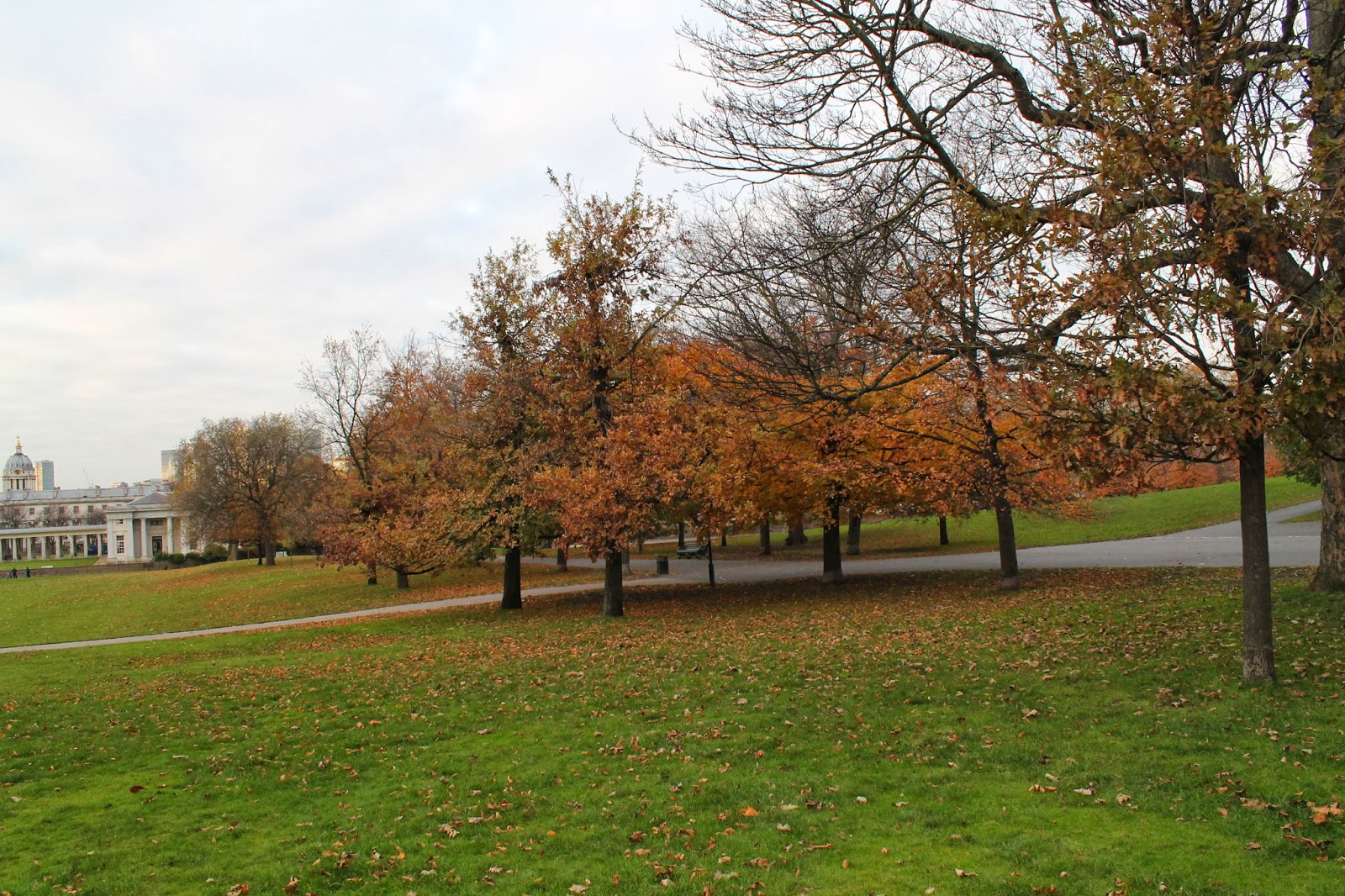
I really like the images as the are very natural and show what beauties the world habitats. I think the fact that I have photographed in the winter is not necessarily a bad thing as it has meant that there are far more bright colours that are organic and inviting. I think that the oranges and the brown will also work on my current digi-pak design as the background colour is white and any colour would work on the blank canvas.

My favourite image that I took has to be the larger image and this is because if you look at the image, it looks as though it has been superimposed, to make the scene seem unnatural, but the image is actually taken on the camera. I also like the way that you are drawn into the image because of the perspective of the scene and the way that both the foreground and sky blend to the background.

I intend on blogging the progress of my digi-pak.

Re-focussed Mock-up Print Advert


As you can see from the above I have re-focussed my print advert to try and make it more successful and this is because I thought that the first design was quite simplistic and unprofessional. I also forgot about some of the conventions that needed to be followed and this meant that it lacked a sense of realism in the industry.
 
I think that this design is far more complex and sophisticated because there is more to analyse and look at meaning that it has been more considered. Some of the changes that I made included changing the background into a neutral colour that was picked up the image. I wanted to do this s that there was consistency throughout the whole of the template. I also thought that a blank canvas would be quite boring for this type of artist; as the light brown is more organic.
 
I think that I like this design far more then the other designs because it has a complex nature about it. I think that adding the CD cover onto this design also works well because it creates product familiarity and makes the artist seem more "real". To improves this template I think that I know need to start finding a way of making the font more readable and making the poster more eye catching as ultimately, this is what sells the artist.

Tuesday, 19 November 2013

Starting to consider Print advert:

Mock Up Design 1-

have as you can see below started to create a print advert that used the same materials that I have used for my digi-pak. Although, my digi-pak is not complete I think that it is best that I do them simultaneously and this is because if I avoid doing them simultaneously then I don't think that the campaign will be as continuous and cohesive as it possibly can. I have used the drawing image in this design and this is because I wanted to use a design that would be coherent, but I also wanted to use the drawing to show that Ruby Collins is not just a normal artist that uses the same keyhole campaign and marketing approach that was set out by Adorno and Horhiemer.

I think that the overall successes of making this mock-up design have to be that the design follows conventions of posters such as the name, a main image, a date and the record label. I have also put a star rating on there as I think that this will show that the star is credible and hopefully make people buy into her image and her originality as an artist. The reason that I put the "telegraph" on there is because generally critics that are recognized in the business work for broadsheet newspapers.
To make the design more successful and to improve the overall image I hope to play around with colour composition, positioning and layers that could be added, but overall I am content with the progress of the design so far.