Thursday, 13 February 2014
Current Video;
This is my current music video with all of the corrections and the changes included. After completing my fourth draft of the video, I thought that I should look back into the video and see if there were any changes or corrections that were needed. I couldn't find any, probably because I had been looking at the video for too long, so I asked my teacher and she thought that making the childhood memories have a different effect would benefit it as, at the moment with the bad TV effect it was too old and I only need to make the footage look a decade old not centuries. So, we both thought that making the footage have a sepia or orange tint would be more beneficial, So, in final cut pro I added this effect and this made the video look far more successful.
I also spend about three hours making all of the stop motion footage all the same size. To do this I had to go back into final cut pro and make all of the footage fit the screen. This would help make the video all the same size. Meaning that it wouldn't be going from rectangles to squares and wouldn't have the black border. After the long and time consuming procedure I found that this actually made the video look more successful. These are the two main changes to the video and I think that they have really benefited in giving the video more of a production value.
At the moment, I don't think that there are many more changes that can be made to the video, though if there are any more changes welcomed by the research I am planning to create on social networks then, I wont hesitate to make the video better.

Friday, 7 February 2014
Making The opening animation and closing
Here there are two videos that each show animations that are going to be at the start and end of my music video. I decided that after watching my music video that there were wasn't enough capturing your attention at the begging of the video. I think that the animations will fit in really nicely with the music video overall as it has a creative flare that fits in with the whole music video. I really like that there is a painting element in this video as it is what I am about as a person so lets me stamp my own individual take on the song.
Planning the Evaluation -
 Evaluation Plan:
We have just been told that we have one week to complete the evaluation.
To make sure that everyone knows my idea for my evaluation, I thought that I would post it on my blog as last time there was some confusion to whether people were copying ideas.
Deadline: 14 February 2014 (though we can spend half term if unfinished)
Questions that need answering:
1.In what ways does your media product use, develop or challenge forms and conventions of real media products?
2.How effective is the combination of your main product and ancillary texts?
3.What have you learned from the audience research?
4.How did you use media technologies in the construction and research, planning and evaluation stages.
How am I going to answer the questions in the most technology based way that I can:
For the first question I plan on having a final cut pro video of myself speaking.
The second question will be a prezi.
The third a video with a sound recording.
The forth a presentation.
Using all of these media platforms will allow me as a media student show my creative flare. Hence, making my evaluation better.
Journal -
So far I have made many drastic changes to my video to try and make it more successful, as I keep repeating, you can see that the video is now arty, I have also took on all of the feedback that Leanne and Sinead gave me and rectified those mistakes, which is great.
I think now to make the video the best it can be, its all about just going back into the video looking at it, spotting some weakness, rectifying them and then repeating the process until there are no more changes and I am completely happy with the way that it is. I will amongst completing this process ask both Sinead and Leanne if they think that anything needs improvements; though I am happy with the way that the video is going.
I think I am going down the right track though of adding footage that has been shot really well as essentially if the footage is of a bad quality and hard to watch, not many people are going to be interested in watching the video. I think that I have secured making sure, that this doesn't happen through y projection, baby footage and the airplane scene.
I think now to make the video the best it can be, its all about just going back into the video looking at it, spotting some weakness, rectifying them and then repeating the process until there are no more changes and I am completely happy with the way that it is. I will amongst completing this process ask both Sinead and Leanne if they think that anything needs improvements; though I am happy with the way that the video is going.
I think I am going down the right track though of adding footage that has been shot really well as essentially if the footage is of a bad quality and hard to watch, not many people are going to be interested in watching the video. I think that I have secured making sure, that this doesn't happen through y projection, baby footage and the airplane scene.
Current Music Video -
This is my current music video with the changes that I have made to the video. I thought it best that I visually documented the process of the video so that anyone viewing my blog could see how the video was shaping. As you can see from the last changes a lot of my video has been altered and had amendments to it so that the video could be become more successful. This has included adding the animations to make the video more cute and artsy which was needed as it fits the narrative of the song and the lyrics perfectly. This was especially clear when I put the window animation at the beginning because it flowed with the beginning lyrics of "three little birds sat on my window".
I also added more stop animations as they had the same arty's feel, they also made the video seem more vintage and retro which was essential as to make this video look like it could really exist it needed to feel organic and vintage. To increase the vintage dynamic of the video I had to use projections thaty connoted that feel including a birds cage, a cake stand and flowers (a daisy field). I think that this really tied in well with the black and white projections as it was very monochromatic.
Other changes include adding paintings into some sections of the footage, i did this so that the video was tied together and more continuos throughout, as it would look very unprofessional if the footage jumped from digital based footage to photographs and paintings really quickly. I think that adding this footage made the video more dynamic as, there aren't that many videos that try and attempt to make arty videos that are ground rooted.
I think in-order to try and make the video even more successful, I need to try and potentially cut out the bad lip syncing as well as make the screen sizings the same throughout.
Re-shot footage

I had after the first screening go back into some of the footage and then improve it by reshooting it. This was both down to the footage being poorly lit or very bad lip sunig. Though, I didn't mind as I want my video to be the best It can be so, I went back into the video and improved it by making sur Ethan this time I used a great amount if lights and lamps so that the footage was really good, to also try and make sure that the footage would have very clear lip syncing I played the song in the background so that the person in the video could actual see what was coming next, the timings etc.
I think that this will give the video more production value. With the better footage I think that this will mean that I can add effects to the footage,meithout it looking poorly lit etc. This will help to make the video comply with the conventions of this genre as, this genre specifically has footage that has a vintage and rustic feel.
So, to make the video comply with these key codes and conventions I can play around with some effects to make this bedroom singing more effective. I think that some of the effects that will work well alongside this footage could be the tint with a quite hig contrast or the 3-way colour correction tool as you can play around with the hue and saturation until you think that it is perefcet for the video.
Journal -
I have now completed a great amount to the video, although it is not all in the video yet in the video I have actually filmed a lot. Some of the new scenes that have been filmed for include the airplane scene, the childhood memories and the projections. I think that this will make the video more successful because it will have more diversity in shots, have more scenes and look more clean cut.
I think the footage shot had a lovely tone and effect to it because I considered the lighting more this time as I knew that the chance of re-shooting was possibly unlikely. I also spend a great deal of time, trying to endorse in arty things as that was some of the feedback given too improve my video. I spent a very long time making the airplanes and this was because I knew that if they were made very clean that would add to the organic and arty feel.
My plan for the upcoming weeks is to try and add all of the footage to the final cut pro document and edit them all in, then working from that I hope to try and see what needs improving and from that just keep updating the video. As well as that I want to carry out some audience research to see if my digi-pak and my print poster are at the highest calibre that they can be.
I think the footage shot had a lovely tone and effect to it because I considered the lighting more this time as I knew that the chance of re-shooting was possibly unlikely. I also spend a great deal of time, trying to endorse in arty things as that was some of the feedback given too improve my video. I spent a very long time making the airplanes and this was because I knew that if they were made very clean that would add to the organic and arty feel.
My plan for the upcoming weeks is to try and add all of the footage to the final cut pro document and edit them all in, then working from that I hope to try and see what needs improving and from that just keep updating the video. As well as that I want to carry out some audience research to see if my digi-pak and my print poster are at the highest calibre that they can be.
Baby Footage
 I had to once again try and make footage that I knew could feel the gaps of my video and I thought that I would try and add footage of the star as a child, as i think that this would fit in with the current footage. I think that this would fit with the current footage, as it is quite relaxed, she is mainly walking through the woods and I think it may even potentially give the video a narrative. The narrative being that she is thinking back to older memories.
 To get the footage I had to find a lot of old tapes of her on film. The I had to bring them all to school, exporting the footage off of the tapes and onto Final Cut Pro, I had to then choose what footage that i thought i could keep. This was a very long process, and was very time consuming. Though, I think that the result of getting the footage was a good one.
 I now plan to add the footage when editing the video, putting it in sections where there are gaps and where I fill that the footage will really fit in. I also plan on putting an effect on the footage, possibly even sepia as I feel that this will make it clear to the audience that she is a young girl looking back at something old. I did try and put a Bad Film effect onto the footage though, that came out looking too old and think that its fine to make the video look like she is looking at nostalgic memories though I can't make it look too old as it will give the wrong impression.
As you can see from the screenshots that I have uploaded, I have added the sepia effect, and I think that this looks really nice on the footage as it makes it look old and rustic yet, not too old that you wouldn't belive that Ruby Collins is a young artists.
I plan to blog the next update on my video and how this looks.
Please leave a comment on possible changes to the footage that you think are necessary or would make the footage look even more successful.
Projections

To try and make my video once again have the arty"s" feel about it that is required, I decided to try and make something that is arty. In this case it was projections onto a wall. To begin with, I had to think of things that could be projected and I thought that I would really like to see quite niche items that have vintage connotations attached to them in the video as that will match the music's tone.
All of the projections that I decided had this connotation included: a daisy field, a vintage birds cage, a teacup and a cake stand.

Daisy Field Projection-
 The first projection was the daisy field projection and I really like this one because Ruby Collins made the action quite comical as, she was blowing the flowers yet obviously they didn't move, so it was quite tongue and check. I also like the way that I could try and change the size and the composition of the flowers.
Birds Cage Projection-
The second projection was of a birds cage and in this projection Ruby Collins pulled up the birds cage by the top and then pinned it to the wall. This stop motion was quite quick in pace and worked really well with the other footage as the actual birds cage was a very detailed projection.
Tea Cup Projection-

The third projection I mixed with digital footage, Ruby drank from the cup and then pushed the cup off of the screen. I liked this because the projection had the fine tuned detailed of the floral patterns on the cup.
Cake Stand Projection -
The final projection was the cake stand and it was difficult to think of an action for this projection as the second projection had a lifting action so I decided to make the video more diverse. So, Ruby in this stop motion would just push the projection away from her after moving her hands a lot.
Areoplanes / Bedroom Stop Motions
 After receiving my last lot of feedback, noting that my video was quite repetitive and didn't have that much of an arty feel, I brainstormed how I would try and make the video less repetitive and have more of a niche feel.
Therefore, I thought that adding some new scenes/locations in my video would make it far more successful as it would help break up each scene and replace any footage that is repeated.
 My first idea was a scene in which Ruby Collins would be in a room, there would be some aeroplanes around her as that way it would feel quite cute; which ties in with the overall feel of the song. It also has quite an arty element involved as the whole setting would be made by me using materials sourced by me and making aeroplanes myself.
When actually filming this footage it was quite fun, though I do have to say that actually making the aeroplanes properly and out of paper and then, tying the string to the aeroplane. And then masking taping it to the ceiling was a very long process and took me quite a while to do single handled. Though the end result and the images that came out really worked well.
I think that when putting this footage into the video, I think that the footage of Ruby Collins singing could be broken up by images of her as that way it wont be as boring and will feel quite cutesy with the poses. I think it will also help cut in the lip syncing so that the chorus hits on point.

Bedroom-
The other location that I filmed was actually a re-shoot which was of the bedroom singing, this was to try and make the footage more successful by making sure that the lighting was less gloomy, the actual character had a more emotive reaction to the lyrics and to put more props in the background. To ensure that this was completed to a perfect standard I put more posters on the wall, got lamps in the room and informed the character that she needed to more emotive. I also filmed in the day time to ensure the lighting was perfect.
 Whilst doing this footage, I also thought because everything went well I could even potentially try and make some more footage.
 In this case it was making a stop motion of random activities of Ruby Collins which happened to be her such as reading a book and her pulling her hair down. Which I think worked well with the lighting and the clean cut images on the DSLR.
In the future, I hope to try and keep updating the new and improved footage, I will also try and put the new and improved footage on YouTube and post this on my blog as soon as possible so that you can see the new changes.
Exporting


Though, this is only an idea that has happened recently, and I don't think that I will do a lot, becuase then it will take more time doing this then completing the actual video itself.

Though, it really did help when I was showing my family the project as they got to see it straight away and suggest any amendments that could be made to the video to try and make it far more successful. In the up and coming blog posts I hope that anyone tracking my blog will see on new posts the exported videos so that they can see the process and the journey of making the overall music video.
The other reason I will avoid exporting on too much on a regular basis is because it is very time consuming and will mean that valuable time on editing will be wasted on less productive tasks.
Also as you can see from the screenshots at the side, it shows that there is a timeline. On this timeline there is a lot of clips and I felt that this is one of the main reasons that I exported this exact version of my music video as, it has so many cuts that I wanted to check when exported it had smooth transitions that run cut from cut otherwise, the production value of the video would be decreased. Hence, changes would be needed.
Editing Some More...


Analysis
After the feedback that I received on my video, I decided that I was going to make some quick cuts on the video. This way I could see what parts of the song could need new scenes.I found that in total there was four main chunks on the time line that could be removed and replaced with more successful footage.
I think this will give me some more footage to play with and in turn give me an opportunity to work back into the comments that I didn't like.
I think to improve the footage I can complete the following points to make it of a better quality:
-Adding new scenes.
-Incorporating arty things in the video.
-Using new digital processes or things that will have more of a buzz feel (stop motion)
-Incorporating more of Goodwin's principles.
Other changes I made to the video including testing out some of the effects that you can get on the footage. To do this you just play around with the effects, until you have the desired tone that you think works. To get onto the effects you go to the main toolbar, click onto effects the, video filters and then scroll through all of the tones. I found that the most successful way of working was not to limit yourself to an effect as you can undo anything that you do.
I think that the most successful effect was the 3-way colour corrector as it was a tool, that allowed me to change the whole colour of the video clips and either make it brighter, darker. So, when adding effects I think that I will use this effect.
Thursday, 30 January 2014
Feedback from first screening:

 Today, was our firs screening for our music video. It was our first opportunity to put our whole music video to the whole, class alongside our Digipak and poster and get some detailed feedback on how the whole project is going.
 We had to present these ideas in a way that we thought acceptable for our genre. I decided to make a quick presentation because it gave me the oppituinty to put what components I thought were the most successful first. For this reason I decided to present my Digipak and poster first as they I think are the most successful pieces and I feel that they are completed.
 The feedback, was very constructive and has now given me an opportunity to work on my project and make it better. Some comments made that were commenting on the project being successful was, the Digipak and the poster. My teacher said they were perfect for the genre and that nothing needed changing.
The only real thing that the teachers found needed the changes and the improvements was my actual video.They thought, my vide was quite repetitive and had far too many shots of her walking, they also thought that sometimes the performance was lacklustre and unconvincing and that I should try and make my video arty; because I'm good at that side of creating things.
First I was dis-heartened by the feedback as expected, though once I thought about the feedback and reviewed the video myself i found that getting truthful feedback was the best idea as now all I can do is improve.The successful parts that the people who viewed my video made comments on where: the tones in the background, he look of the star, the locations, some of the camera work, the projections and the stop animation.
Journal
As a result of the feedback that I received yesterday, I have made plans to try and improve the video to the best of my ability so hat I know I am completely happy with the final outcome. I hope to try and make the scenes that we unconvincing, more convincing by upping the Mise-en-scene, photographing more up close, adding effects and asking the female playing Ruby Collins to be more animated and interested.
Because of the feedback that was made, I have also decided that I will also try and make my video more arty, to do this I will try and make the vide have a vintage effect, that is applied through Final Cut Pro. This will give my video more production value and hopefully increase the mark.
As well as this I think that it would be beneficial to have more projections with Ruby Collins in, to try and incorporate painting and get baby videos in the video too; to make it more cute.I have also decided that I will try and re-do the mirror scene by making t more bright so that the audience can actually see what is happening as, it is quite hard to actually tell what is happening and when.
Arty Plans:
 Planning to make my video more arty: Some of the feedback from the first screening was that my music video wasn't quite arty enough. For this exact reason I have decided that I am going to be putting more acetate sequences/scenes into the video using projections.
Though, this time I really would like the projections to involve Ruby Collins in them as it will be more interesting.I think this will allow me to have the projections onto Ruby Collins' face and involve her in the arty scenes.
I also plan on having more lyrics projected in the video as that worked well in the first screening and was received well , it will also help me break up the video more and make sure that the video is less boring. It means that I can also now try and get rid of some of the footage that was too repetitive.
Some of the things that I really would like to try and project onto Ruby Collins face include flowers, a projection of her as a child and possibly a cup and record player. I will put these files all onto word, print out and then photocopy onto acetate ready to project.I will blog as and when the process is over, illustrating what worked, what didn't work as planned etc.
Tuesday, 28 January 2014
Final Digi-pak Poster:

Making it clear what designs are my digi-pak poster:As Leanne and Sinead, have said from the feedback that my print advert was lovely and that both the digi-pak and poster together presented a consistent image. I thought it best to try and make the design clear and clean and because I am going to have more then one poster I thought it best t select which ones were he most successful and then put them all together so there is more consistency.
I really like the fact that. Have put them together as it nicer to see what is going on and what type of artist I have. Also because there is more than one poster it means that my star is presented as less one dimensional. I think that the designs and the effects that I have chosen were good choices as they all interlink through the layout and the only noticeable difference is the effect changed.
Thursday, 23 January 2014
First Screening:
Materials and sources used for my first screening of my music video:
This is the presentation I used as a guideline to present my design to the class.:
This is my current music video, prior to the indents changes that need to be made.
This is the presentation I used as a guideline to present my design to the class.:
Wednesday, 15 January 2014
Journal Entry-
This is my most current Journal entry so far, since my last Journal entry it is clear that I have made great progress with the coursework and that my project is finally shaping to be a coherent cross media platform campaign. I am finally quite happy of what I am starting to achieve for this project as, it s starting to look more like the work I intended to produce.
I have so far this week started to film new scenes so that my video didn't look so empty and actually had a variety of locations. Whilst at the woods this week, I started to consider the way that the natural light was reflecting so that I knew that the mise-en-scene was as good as I could have tried to. I also tried to make sure that the video had more lip-syncing. Hence, why the woods shooting was very heavy on the lip-syncing. Though, this time when filming I thought that it was essential to make sure that Ruby Collins was lip syncing to the best of her ability.
So, to try and help her lip sync to the best of her ability I purchased the song on an iPad and then took the iPad to the locations when we filmed so that, Ruby Collins would know when to sing and the actual timings of the song as well as the pauses in the song or the instrumentals. This would also make it much easier for me to edit as well, because I can hear the audio in the background of the footage.
I also got the chance to reshoot the bedroom singing which was poorly lit the first time around, though I think that the footage may be quite bland or uninteresting as Ruby Collins ( Lauren Madden) wasn't that emotive again/ Therefore, I may have to try and re-film again to make the footage more interesting. I plan to in the up and coming weeks look at making the video better, by introducing new scenes etc.
I have so far this week started to film new scenes so that my video didn't look so empty and actually had a variety of locations. Whilst at the woods this week, I started to consider the way that the natural light was reflecting so that I knew that the mise-en-scene was as good as I could have tried to. I also tried to make sure that the video had more lip-syncing. Hence, why the woods shooting was very heavy on the lip-syncing. Though, this time when filming I thought that it was essential to make sure that Ruby Collins was lip syncing to the best of her ability.
So, to try and help her lip sync to the best of her ability I purchased the song on an iPad and then took the iPad to the locations when we filmed so that, Ruby Collins would know when to sing and the actual timings of the song as well as the pauses in the song or the instrumentals. This would also make it much easier for me to edit as well, because I can hear the audio in the background of the footage.
I also got the chance to reshoot the bedroom singing which was poorly lit the first time around, though I think that the footage may be quite bland or uninteresting as Ruby Collins ( Lauren Madden) wasn't that emotive again/ Therefore, I may have to try and re-film again to make the footage more interesting. I plan to in the up and coming weeks look at making the video better, by introducing new scenes etc.
15/01/2014 Editing-
 Editing-
I have started to edit the footage that I filmed yesterday today, mainly because I had the time and it was a convenient time to actually start looking at the footage and also because I thought it best that I edited quit quickly after filming so that I knew from the previous day what went where and why a particular thing needed to go there.
 Today's editing, was quite problematic as the system kept crashing and I kept loosing the edited footage that I had worked on. After this happened several times, I began saving my work compulsively so that nothing got lost. This ending up in me saving too much. Then, I cam back to finish when the systems network was less occupied and this allowed me to spend more time on the video making it better.
So, I actually got the opportunity to sort out the mirror footage which was a great opportunity as I got to learn how to change the brightness to the footage making it easier to see Ruby Collins. I am as of yet to sort out the bedroom scene though, but this is my main priority for changing tomorrow. I also hope to try and possibly look at effects that could be added to the footage to give it more production value.
Filming 14/01/2014
Filming the mirror scene and the Bedroom singing-
Today, I decided that I was going to try and film all of the footage left that I had planned so that I knew that all of the footage that I need for my music video was complete and so that I knew that all I had to mainly complete was computer based. Today, I filmed for the mirror scene and the bedroom scene.
The mirror scene-

The mirror scenes purpose was to film Ruby Collins putting a lot of make-up one and then taking it off after realising that make-up is the root to solving problems and showing to the audience that its wrong to think that anyone's appearance defines them as a person. This linked to the visual; " you don't even have to try any longer, do what you want to" Which I think is basically saying that you don't need to be defined by society and that you can control your own life with out worries. This sequence had many cuts, but because the lyrics were quite short, I didn't really need to keep on filming for along time.
The props that were used for this project: A circular mirror, quaint jars, equipment make-up, make up brushes, little cute pots, extension leads and all of the camera.
The Bedroom Singing:

This scene was actually quite problematic and resulted in a lot of arguing which was mainly down to me having a perceived idea of perfect singing. As I am quite an animated character around my friends I had the idea that Ruby Collins' would be very animated and get into the lyrics more. Although, I understand some people are less confident and don't like singing in front of cameras, I hoped that Ruby Collins would be very animated though the person I chose for the project was not prepared to be as animated as she is quite timid and shy.
So to get the footage for this scene I had to negotiate in the middle and I think that for a shy timid person the footage was quite good and that I was probably being too much of a diva asking and then shouting at her. Poor management on my part.
Props used for the filming: flower patterned sheets, pillows, new outfit, fairy lights and fashion books (showing she is into fashion)
What is your next step?
The next step with all of the footage I have hot is to edit over the next few days, as there is a lot of footage that has to be changed and edited, I wont objectively say when this will be finished as there is a lot of footage that has to be edited.
Today, I decided that I was going to try and film all of the footage left that I had planned so that I knew that all of the footage that I need for my music video was complete and so that I knew that all I had to mainly complete was computer based. Today, I filmed for the mirror scene and the bedroom scene.
The mirror scene-
The mirror scenes purpose was to film Ruby Collins putting a lot of make-up one and then taking it off after realising that make-up is the root to solving problems and showing to the audience that its wrong to think that anyone's appearance defines them as a person. This linked to the visual; " you don't even have to try any longer, do what you want to" Which I think is basically saying that you don't need to be defined by society and that you can control your own life with out worries. This sequence had many cuts, but because the lyrics were quite short, I didn't really need to keep on filming for along time.
The props that were used for this project: A circular mirror, quaint jars, equipment make-up, make up brushes, little cute pots, extension leads and all of the camera.
The Bedroom Singing:
This scene was actually quite problematic and resulted in a lot of arguing which was mainly down to me having a perceived idea of perfect singing. As I am quite an animated character around my friends I had the idea that Ruby Collins' would be very animated and get into the lyrics more. Although, I understand some people are less confident and don't like singing in front of cameras, I hoped that Ruby Collins would be very animated though the person I chose for the project was not prepared to be as animated as she is quite timid and shy.
So to get the footage for this scene I had to negotiate in the middle and I think that for a shy timid person the footage was quite good and that I was probably being too much of a diva asking and then shouting at her. Poor management on my part.
Props used for the filming: flower patterned sheets, pillows, new outfit, fairy lights and fashion books (showing she is into fashion)
What is your next step?
The next step with all of the footage I have hot is to edit over the next few days, as there is a lot of footage that has to be changed and edited, I wont objectively say when this will be finished as there is a lot of footage that has to be edited.
Tuesday, 14 January 2014
Finished Digi-pak Design-

Digi- pak finished design -
This is my current finished Digi-pak design; I have as you can see a conventional six panel structure accompanied by two CD designs too. I quite proud of this design, as the designs look well considered and because once I had put the six panel design and the CD designs on the white blank background, it actually looked really professional for a project curriculum based.
The successful parts about this digi-pak have to be the thought into the way that the consumer sees the product; by this I mean the consumer will see this product as a considered product that has been thought throughout the process of making. Including the bleak colour scheme in the inside three panels, the bright colours of the CD's that conflict the bleak colour scheme and the bright colours of the front two panels as they are fundamental to catch attention.
As well as the cropped technique applied using Photoshop tools to give the urban ground rooted feel about the design as it is assisted by the black and white colour scheme. This colour scheme works well with the design because even though the exposure and the colour changes, they are of a similar palette, so still follow on from another. The other success of this design has to be all of the digi-pak conventions have been considered including: the record labelling, the photos, copyright information, the inside leaflet design, the barcode, album name, artist name, promotional deals and social media contact detail.
I think I will only improve this design once the first screening is over, as I feel that my view is only my view so ultimately I am quite bias to making the design, so new ideas should come from the people in my class going through the same procedure instead of me.
Accoustic CD design-
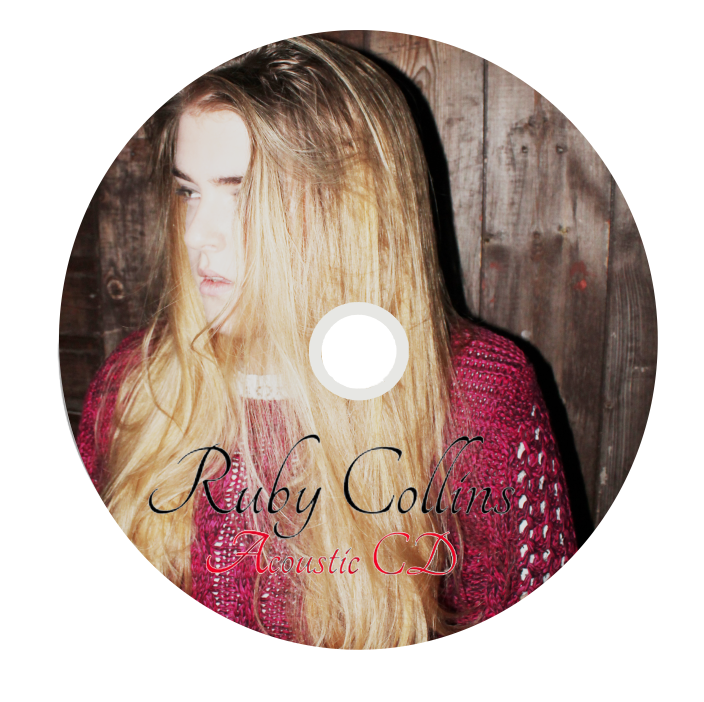
After completing my digi-pak quite some time ago, I thought that it was time for me to now think about how I could progress my design and make my digi-pak as good as it possibly could be. In order for me to make the overall design very coherent I thought that I should look at the small details in the digi-pak, this happened to bee the CD design. So, I decided that I would make two CD designs and then add them to my digi-pak. To make this design, from my test shots that I completed quite a while ago, I selected an image of Ruby Collins (Lauren) posing then, to make the design more considered I played with brightness and exposure contrast controls so that the design looked well lit; as this is a convention of feel good jazz and pop.
What is successful about this CD design?
I think that the positioning of the text as well as the font works really well on the design as it stands out and the colours are all of a similar palette meaning that it has a coherent colour scheme and style. I think the curvy writing also is quite conventional of this genre of music as it has quite a controlled refined nature about it. I also feel that refining the design even more would be quite difficult, not becaasue I think my designs are amazing, but because I think it will distract from the rooted vibe.
CD cover -

This is my main CD design, after looking at my digi-pak design I noticed that there are many changes that could be made to my digipak to try and make it more coherent. One of theses changes included trying to make sure every detail is completed; so I have started to make a CD for my digi-pak. To make this design, I had to try and find an image that I thought represented the understated light heart nature of the music that accompanies the digi-pak and when looking I selected the above image. I thought because this image was so laid back and "cutesy" it could give of the impression that Ruby Collins' doesn't take herself extremely serious and that it's alright to be happy and calm in any situation.
Furthermore, I imagine that this album would be put on when someone need to feel better about themselves and feel at ease thus, I thought that it was a great idea to put a comical pose on. To link the cover to the "outdoors" theme that I have pitched since the begging, I made sure that the pose was in a tree and to assist the pose and the location I brightened up the image to make sure that the trees earthy greens stood out. It also meant that the font that I had used and the colour of the font stood out and was readable.
Tuesday, 7 January 2014
Poll on Digi-pak Covers -
Below is a poll that I created to see what design what the best design for my digi-pak cover, this was because I was confused as to what design was the most successful. Please vote below to cast your personal opinion, consider that this is a new artist.
Calendar:
January Deadline:
As the deadline is closely looming towards me, it is important that I create a calendar with provisional dates of completing certain things, this will help to ensure that my first screening of the music video is good and that I have good feedback that is constructive, as oppose to feedback that basically says that my video is poor.
Below I have made the provisional calendar dates and it is now up to me to make sure that everything is completed by these dates. I hope to keep to track with this as the last thing that I want is an uncompleted music video that makes me look and feel anxious when presenting. To ensure this calendar is followed, I will post blog post on my blog routinely.

As the deadline is closely looming towards me, it is important that I create a calendar with provisional dates of completing certain things, this will help to ensure that my first screening of the music video is good and that I have good feedback that is constructive, as oppose to feedback that basically says that my video is poor.
Below I have made the provisional calendar dates and it is now up to me to make sure that everything is completed by these dates. I hope to keep to track with this as the last thing that I want is an uncompleted music video that makes me look and feel anxious when presenting. To ensure this calendar is followed, I will post blog post on my blog routinely.
Next Location:
There are a few locations that will need planning for the future, as they will appear in my music video. I am currently planning the next locations for my music video as they will need to be shot as soon as possible. So, far i have three locations in mind and that will bring me up to a total of five major locations meaning my music video has quite a conventional amount of locations.


The first location that needs planning is the bedroom scene- I plan to in this location just shoot Ruby Collins singing the whole of the song from many different angles. So, that throughout the music video i can drop in as many frames as possible of her signing the song and because the song is quite fast paced it means that I will need a lot of cuts throughout the video.
I want the location to have fairy lights on the wall, a neural pattern on the wall so that nothing distracts from the artist and nothing seems to unrealistic.
The second location that i am planning is the scene which Ruby Collins looks into the mirror and references the lyrics that "you don't even have to try any longer, do what you wanna, girl put your records on..." This will link to Goodwin and make the video more professional.
Though, when I am filming this scene I have to make sure that I don't shoot unprofessionally as it will loose the production value that i desire.
I have though, made sure that i can get the same mirror so this is a good thing as it means the image I have sourced from google is not an unrealistic photograph to the way that I want to shoot the film.
Editing 07/01/14 :

 I have now started to edit the footage that I shot at Bostal Woods. The editing of this footage took me quite a while as i wanted an animation piece in my video. I was quite quick in saying that I wanted this footage at first, but I didn't realize how much time and effort it would take by cutting each image individually and then lining them up would take. I still think that this specific footage could be re-focussed so that the images at the front are not too long. As the pace changes.
Some of the footage included: Her kicking leafs, her running around and walking past a tree. These pieces of footage could be used as a montage in the video to fill it up and have more cuts.
As you can see from the last screen shot it shows that so far over half of the track that I have been working on has some sort of footage that can be used as imagery for the video which is a great sign as it means even with the other footage i am near to the end.

As that is the primary purpose of creating a video. I plan to now try when i edit the video to make sure that there are no techniques I could use to make the video more effective and entertaining.
Monday, 6 January 2014
Refocussing the deign of my digi-apk:

Making modifications to my digi-pak design
I have made the digi-pak more coherent by changing the first inside to the drawing of Ruby Collins as before the drawing was on the back cover. I am quite happy with the way that these designs have turned out as they look really effective and the colour scheme is far more smooth and has a transition from each panel. As the black and the white designs ties it all together. This is especially clear because there is black on every panel as well as light tones too.
To make my digi-pak look more successful I need to consider small details such as putting a black strip in the inside panels as well as possibly considering other components to the digi-pak that will enhance the overall feel of the video and make it more believable in the music industry. I think if I am going to do this I should possibly try and create designs for both the CD's chowing what designs would be expected on both of them.
Overall, though I am really happy with the way that the digi-pak is looking so far as I think that I have all the conventions possible: ranging from the barcode, the social network links, the record label, title and spine to the promotional stickers. So on that frontier nothing can be added. I also think that I have lovely photos that have all been taken by me and edited by me unlike some other groups.
I will make the changes necessary to make this design more professional, though the foundations are very much there. Please watch my blog to see continuous visual developments.
Re-working my front cover design of my digi-pak:

Today, I felt after show my digi-pak front cover that it could be improved to get a better mark.
I showed my teacher the provisional design, that I was working on and she said that the design was good and inventive, yet she doesn't think that any new artist starting out in the music industry would not have a picture of the artists face on the front cover.
After receiving this constructive criticism I thought that now was my opportunity to make the changes to make the design better. So I switched back the design of the drawing, played around with the tones to get a consistent design and changed the composition. I now think that the design is as coherent as it possibly can be, for the front cover.
Though, to make sure this is clear I will hand out a survey to people asking which design they think is better out of the location shot and the drawing of the artist. I will blog the feedback and make changes where are necessary so that the design is the best it can be. I will also ask both my teachers which design that they think is best and document the feedback that they have on the designs and once again make changes where I think that they will be needed.
Subscribe to:
Posts (Atom)