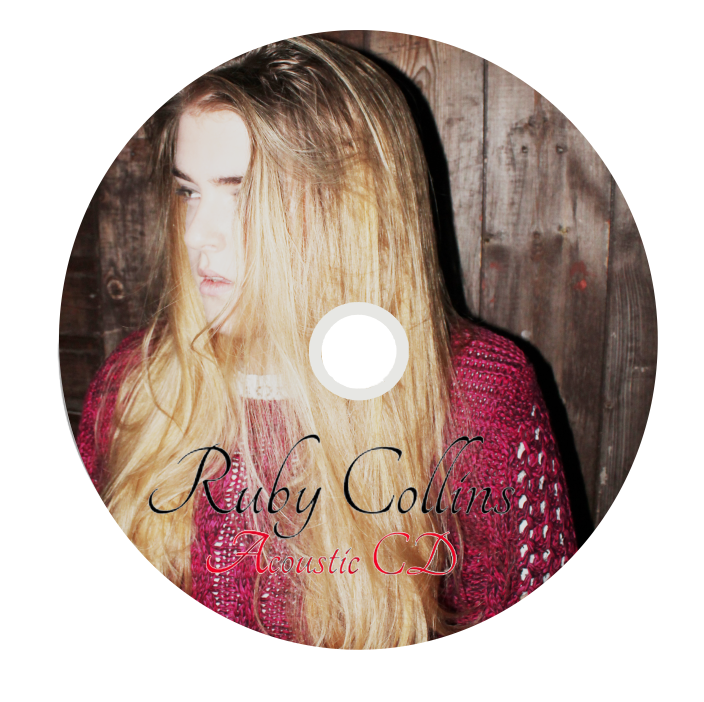
After completing my digi-pak quite some time ago, I thought that it was time for me to now think about how I could progress my design and make my digi-pak as good as it possibly could be. In order for me to make the overall design very coherent I thought that I should look at the small details in the digi-pak, this happened to bee the CD design. So, I decided that I would make two CD designs and then add them to my digi-pak. To make this design, from my test shots that I completed quite a while ago, I selected an image of Ruby Collins (Lauren) posing then, to make the design more considered I played with brightness and exposure contrast controls so that the design looked well lit; as this is a convention of feel good jazz and pop.
What is successful about this CD design?
I think that the positioning of the text as well as the font works really well on the design as it stands out and the colours are all of a similar palette meaning that it has a coherent colour scheme and style. I think the curvy writing also is quite conventional of this genre of music as it has quite a controlled refined nature about it. I also feel that refining the design even more would be quite difficult, not becaasue I think my designs are amazing, but because I think it will distract from the rooted vibe.
No comments:
Post a Comment