
Tuesday 29 October 2013
Monday 28 October 2013
Carbon Prints:
I have as you can see from the images started to explore a
new way of making my digi-pak more visually interesting. I tried to do this in
a more creative way, so as you can see what I have done is introduced carbon
printing too my digi-pak cover and this is because as an art student I know how
to use mediums that more arty.
 To start with I began by printing some of the images that I
took the other day of the model. I used these images specifically as they were
good images that were in focus meaning that when doing my carbon print the
final product would be more successful. Then, using making tape I taped the
images to the carbon paper and card and printed the images by drawing over the
top of the image creating a replica.
To start with I began by printing some of the images that I
took the other day of the model. I used these images specifically as they were
good images that were in focus meaning that when doing my carbon print the
final product would be more successful. Then, using making tape I taped the
images to the carbon paper and card and printed the images by drawing over the
top of the image creating a replica.

 I am very happy with the overall outcome of these prints and
this is because were they have been handcrafted it means that the outcomes have
a very unique organic feel surrounding it that cannot be replicated through an
image or photograph. My personal favourite print out of all of the prints has
to the third print with the most detail in as it is clear to me that it is Ruby
Collins and her image is very recognisable, meaning that this type of print
could go onto the front cover of the album because her image is recognisable.
This is because the first album that a brand new artist releases should have
their image on the front panel and this is because as a media platform it
should create product familiarity.
I am very happy with the overall outcome of these prints and
this is because were they have been handcrafted it means that the outcomes have
a very unique organic feel surrounding it that cannot be replicated through an
image or photograph. My personal favourite print out of all of the prints has
to the third print with the most detail in as it is clear to me that it is Ruby
Collins and her image is very recognisable, meaning that this type of print
could go onto the front cover of the album because her image is recognisable.
This is because the first album that a brand new artist releases should have
their image on the front panel and this is because as a media platform it
should create product familiarity.

 To start with I began by printing some of the images that I
took the other day of the model. I used these images specifically as they were
good images that were in focus meaning that when doing my carbon print the
final product would be more successful. Then, using making tape I taped the
images to the carbon paper and card and printed the images by drawing over the
top of the image creating a replica.
To start with I began by printing some of the images that I
took the other day of the model. I used these images specifically as they were
good images that were in focus meaning that when doing my carbon print the
final product would be more successful. Then, using making tape I taped the
images to the carbon paper and card and printed the images by drawing over the
top of the image creating a replica.
 I am very happy with the overall outcome of these prints and
this is because were they have been handcrafted it means that the outcomes have
a very unique organic feel surrounding it that cannot be replicated through an
image or photograph. My personal favourite print out of all of the prints has
to the third print with the most detail in as it is clear to me that it is Ruby
Collins and her image is very recognisable, meaning that this type of print
could go onto the front cover of the album because her image is recognisable.
This is because the first album that a brand new artist releases should have
their image on the front panel and this is because as a media platform it
should create product familiarity.
I am very happy with the overall outcome of these prints and
this is because were they have been handcrafted it means that the outcomes have
a very unique organic feel surrounding it that cannot be replicated through an
image or photograph. My personal favourite print out of all of the prints has
to the third print with the most detail in as it is clear to me that it is Ruby
Collins and her image is very recognisable, meaning that this type of print
could go onto the front cover of the album because her image is recognisable.
This is because the first album that a brand new artist releases should have
their image on the front panel and this is because as a media platform it
should create product familiarity.
To make the carbon prints more visually attractive I plan to
introduce colour to them including watercolours, acrylic and felt tip. First, I
will explore what works well and then I will start to refine the cover more.
Below is my favourite Print:
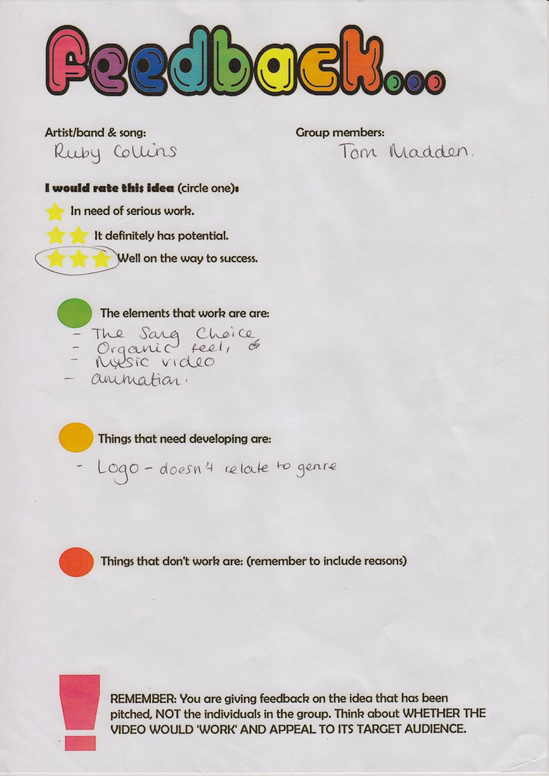
Feedback from the pitch:
The Feedback Sheets:


The feedback from the pitch was very constructive which was brilliant. Leanne made the point of me not having enough detailed audience research and I knew that this would be the case as, I am finding it hard/difficult to juggle all of the tasks on my own, which is expected. Leanne also said that the fonts chosen were all good but, there needs to be a refinement in the chosen font and then I should start to explore that font in more specific routes by creating colours and then handing out to a series of people to get an even larger audience research portfolio.


The feedback from the pitch was very constructive which was brilliant. Leanne made the point of me not having enough detailed audience research and I knew that this would be the case as, I am finding it hard/difficult to juggle all of the tasks on my own, which is expected. Leanne also said that the fonts chosen were all good but, there needs to be a refinement in the chosen font and then I should start to explore that font in more specific routes by creating colours and then handing out to a series of people to get an even larger audience research portfolio.
Other comments that were constructive included carrying out
more audience researching, choosing a font specifically and refocusing the
demographic. As a result of the comments I hope to within the upcoming week
rectify these mistakes by changing my audience profiling, then focusing on one
font. The last thing I need to do is focus the narrative of my story that will
go in the music video so that it is more through.
I do though have to recognise that there were positive
comments that came of the pitch including:
-The image of the model is consistent to the description and
tone of the artist.
-The tone that I talk about is consistent with the genre and
will work if carried out effectively.
- The organic essence of the music video can be brought in.
-The artistic element is a great idea.
Starting Pitch 2 for Digi-pak:
I have started to create a pitch that will be shown to Sinead and this is because this pitch is supposed to present what we can see our planned artist’s digi-pak will look like. For my pitch I created a final cut pro video that had images throughout the video. The images included the mock-up images that I have took so far and this is because they show how my preparation has been going. I also included the carbon prints as they show what I can see my album cover looking like.
Last of all I also included the thumbnail sketches of what
my 6-panel digi-pak might look like and this is because it is a good reflection
from what I imagined my digi-pak to look like and how I am shaping that and
progressing to that stage.
This pitch is not completely finished but making the pitch
early allowed me to speak to my teacher and to ask what could be potentially
added to the video to make it better. When, speaking to Sinead she said that I
could try to put all my ideas onto Photoshop and play around with Photoshop a
bit more because this will allow me to see what will actually go on my digi-pak
as well as what I may reject. It also gives me the chance to play around with
the design that currently have. She also said aim to have written communication
also.
Ruby Collins; Pitch (Leanne)
This is the pitch that I have created for Leanne’s lesson. We were all as a class set the brief to make a pitch that would be displayed to the class presenting the idea of our artist and presenting some points that Leanne asked us to talk about such as the name of the artist, the logos, research, costuming, models etc.
In my pitch I made sure that I included the name of my
artist, demographics, and target audience, a brief of my artist, costuming,
inspirations, record label and style of my artist. I think overall that is all
that I think that will be needed for the audience to make a fair judgement on
my artist.
I created both a final cut pro video as well as a
presentation but I combined both together. I do think this could be a risky
move as I don’t know how much I will need to say on each slide. So, I am
prepared to show the video and then if needed go through the PowerPoint
afterwards, if I didn’t get enough time to talk about it, this may look
slightly unprofessional, but I would rather my audience to be well informed
then not.
I included everything I have done so far, this is because I
want my teacher to understand how much work it has been for one individual and
that every decision I have made so far has been in keeping with the profiling
that I created. I also included everything that I have done so far, so that the
audience that receives the pitch can tell me what they think of my idea and
whether it is following the right route, they can also tell me if the tone
changes in the work I have produced.
Sunday 20 October 2013
Sketches from Photos


Here, I have completed some sketches after taking images of Ruby Collin (Lauren). I completed these sketches because I would like my digi-pak to have a creative element to it, and I feel that this can only be created through introducing art to my digi-pak. They were quite quick sketches and by no means are going to be used for the final product, but they are a good starting point. From this experience it has only made me want to introduce drawn images to the digi-pak even more. I quite like that all of the images have a background that is clear and white and this is because it means that the black from the fine liner is enhanced and far easier to interpret.
Overall, all three of the quick sketches came out quite well. I do think though I need to make sure that they are all the right size and that some of the finer details such as the tone, shading and the proportions of the body are all correct as this could make the outcome less appealing to the audience and will also make the outcome less professional; thus, not being genre specific.
To improve the outcomes that have been created from these quick sketches I plan to start looking at new art mediums that will enhance the quality of the overall outcome. The mediums that I plan to start using include: carbon paper- because carbon paper picks up every detail that is drawn, paint (watercolour, acrylic etc)- because paint introduces colour which makes the outcome of the sketches far more visually interesting to look at.
Therefore, in the upcoming week I need to:
-Explore mediums
-Play around with composition
-Look at the impact of light
In conclusion, this self set task was quite interesting moreover, its time to inject more visually interesting mediums to the outcome.
When showing these sketches to someone around me, they said that this outcome was very interesting. But, they did point out that I do need to make sure that I make sure that the outcome is very detailed and picks up every line and this is because where the sketches at the moment are quite undetailed they don't convey an organic vibe clear in this genre of music.
Digi-Pak Mock up Design
Digi-pak design:
These are the photos from my digi-pak mock up design that I created a week ago. This is an average 6-panel digi-pak and so far this is the type of digi-pak that I think that I will possibly end up creating. It may end up being a digi-pak that exists visually or physically, so far I am not sure of this though.
The front cover- The front cover will, if my pan is consistent with the finished product, will have an image of Ruby Collins to establish her profile as an artist. It will also have a bonus but sticker as I feel that will make more potential buyers purchase the album as promotions attract an audience. On the front cover it will also have the conventional album cover and the name of the artist to establish product familiarity.
Back Panel- The back panel should have the track listing, as well a drawing of an old record payer as it will revive the old time; hopefully making the album have an almost retro feel. I also want some drawings or images of flowers on the back cover as I feel this will be in keeping with the inside panels that explore nature.
Inside three panels- The inside three panels are all cohesive and lead on from each other.
Panel one inside, starts the continuity as the drawing of the tree leads the branches onto panel 2 and then to the top of panel 3. There is once again conventions abided by. The first inside panel had a slot which fits a conventional booklet of the artist inside. I chose to apply this type of convention as it should be in a digi-pak as, it gives information on the connotations behind a single as well as information about the artist that would make the artist's fan base larger.
The second and third inside panels- These panels will hold two CD's. One of the CD's will be the actual album and the other will be a bonus extra CD that is an acoustic version of the first album. The reason and meaning behind this is because Ruby Collins excepts her routes and has integrity in the music world, she also encourages others to aim to be in the music world hence, allowing ready made artists to use her singles.
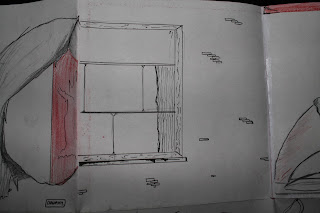
The opening panel to the inside three panels- The opening panel to the three inside panels will have a window on it, this is because I want this panel to reference the lyrics of the song. The fist line is "Three little birds sat on my window" thus, I will have a window that almost looks in the digipak


 .As of yet I'm still reviewing the idea of trying to use Swiss graphics as I feel that it is quite clinical and possibly not organic enough for the type of artist that I am trying to portray.


Photoshoot- Ruby Collins


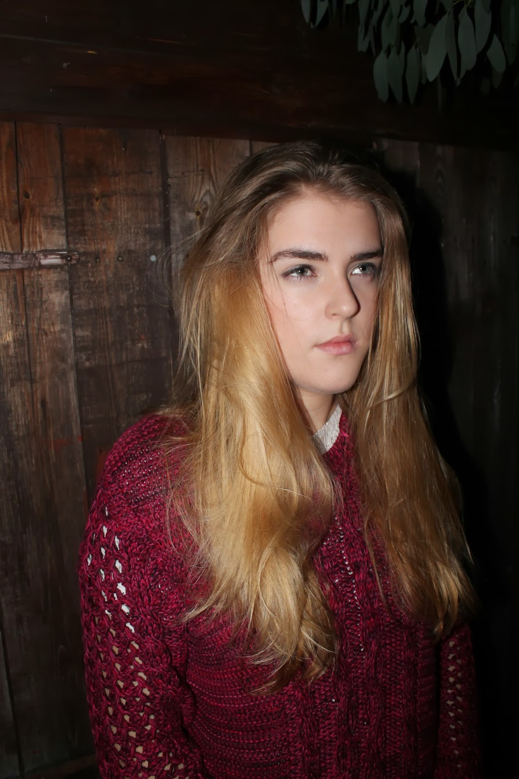


Mock-up Photos for digi-pak:
These photos are some mock-up photos that I can see myself using for the digi-pak design. Here I have taken a range of shots of Ruby Collins to see if the image that she has is coherent with the artist profiling that I have made. This was a very exciting process as, it was the first time that I got to envision how the artist would physically look thus, I had to devise a style that would work for Ruby Collins. The main styling that I think was successful for the photo-shoot that I chose today was the very organic clothing that was in fashion. I think that both the kimono and the red jumper worked really well because the kimono was black and white meaning that it was understated, but the pattern worked alongside the white top as, there wasn't too many patterns blended together. The red jumper also worked well because the red was on a knitted jumper which is quite organic and the fact that the jumper was made of wool, gave it that earthy feel.
I also decided to take the pictures when it was pitch black outside and this was because an art student that I know told me that this is the best time to take the image, with the flash on as it is the only way to get the best exposure that you can. I agreed form the end results definitely as all shots where in focus and the lighting did not look superficial.
As for the hair, I didn't do much with the hair except make the model make it less clingy to her head as the windswept hair is consistent with the image of artist in the jazz and soul genre. I think that the most successful images that came of today, had to be the images when she was not looking at the camera and this is because looking at the camera can make people awkward thus, there face goes slightly peculiar and there expression is hard to read. Therefore, for the real photos I will aim to have once again another variety of images, they will aim to have the same clothing, of not more of a range and the hair will be refocused with a messy look or possibly a perm.
Scenery- Digi-Pak Panels


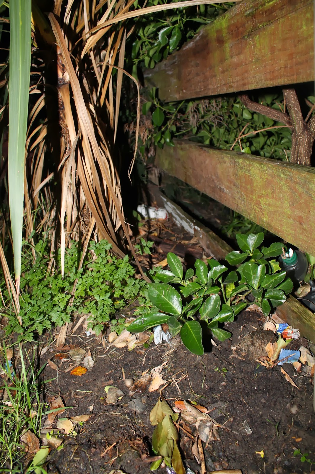

As you can see from below I have taken many images today of
scenery that could potentially go on my digi-pak cover. The images were all
mock-up shots thus, they gave me an insight into how I will take the images in
the future as well as what flower will be in the frame. I took all the
photographs on a DSLR camera as it provides the focus of the item that is
needed and the quality of the image presented on this specification of camera
is greater than digital.
I have many photographed plants and flowers, though I have
photographed trees and this is because as you can see from my mock-up design of
my digi-pak I saw myself revolving three of the panels around a tree that
follows on each panel. I have also taken images of the wood from a shed as I
feel that the brown painted shed presents a very organic vibe.
Overall the success of my photographing scenery today was
showing me what I would potentially photograph in the future. I think that the
fact that I photographed the images in the night meant that the best exposure
was accessible and this is shown in the results of the images. Though, I do
need to be far more specific when taking new images and this is because the
composition needs to be more through and the actual flower should be more considered.
To make sure that this happened I plan on making a detailed
plan, detailing what to photograph the planned composition and possibly even
visit a flower shop as it means that I get exposed to more flowers that present
the vibe that I want. Therefore, I do also need to check a florist gives
consent to me taking the photographs. I have though shown these to my media
teacher and she agrees that the way forward is visiting a flower shop, doing
more flower research into connotations behind certain flowers, but she
recognised that these images are nice and clean but some images do loose a
sense of sophistication because of the setting.
Subscribe to:
Posts (Atom)