Choosing a Logo:
These are all of the fonts that I have personally chosen for my artist whilst visiting a site that specifies in fonts called dafont.co.uk. I used this website specifically because this website is non-copyright meaning I can use these fonts legitimately. I chose in total five fonts as over five would have been excessive and three or below would not have given enough variety to the sample that I plan on asking to look at these font. There are a range of fonts but from an artistic style because I want the artist to come across as very creative.
This is the first font I like this font because it has a clean cut and is very precise. I'm not completely certain in portrays an artic feel though and this is because the font is very clean and sharp.
I also like the second font because its curvy and where it is in block writing it means that the font can be filled with a variety of colours.
This third font is nice because it has a pattern inside of the naming which I could filter with many colours. Though again, I am not sure this font is exactly what I am looking for and this is because the I read into each individual letter because of the pattern so would avoid reading the name immediately.
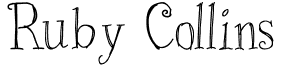
This forth font is my current favourite and this is because this font is readable, organic and looks very artistic. I also think that the curve on some of the letters is nice as stereotypically curves highlight females.
This is the last font that I looked at. I like this font because it is curvy. I would say though out of all of the outcomes that I have picked to be a font this is my least favourite and this is because this font is very difficult to read and does not have an organic feel that is associated with females soul artists.
To make sure that I choose the right font I plan on researching by giving out questionnaires asking people which font they preference.


No comments:
Post a Comment