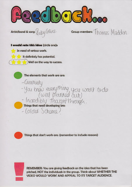
Generally people thought that my current progress with my digi-pak was good and that was because I received 3 stars from 9 out of the 10 asked to fill in feedback forms (one avoided the star rating). I think the feedback was honest and even if I don't agree with some feedback I have to be respectful of peoples opinions toward my progress.
I was completely in acceptance with one comment made that I should use watercolours to add colour to the front panel and as you would have seen from my blog I have already considered this. Therefore, I was very happy to hear that someone agreed with me, without me saying it directly. Other comments that I agreed with included re-shooting the images. Obviously, this comment in some respect is irrelevant as my digi-pak currently is a "mock-up" design meaning that it will changed anyway and the images will be retaken so I appreciate the comment but this is already going to be rectified.
There was though one comment I did not understand. Someone said that my digi-pak covers name was not understandable. Possibly I was not clear enough in my speech about why I used the random name. The name is "Swaying Rust" and this was because I wanted to apply personification to rust because rust is very earthy and organic and swaying is very natural. Meaning the name has a tone I can imagine a jazz artist singing about because it is not superficial. It also juxtaposed the neat font which is interesting. Moreover, without sounding unappreciative of this feedback, I will not be considering the judgement as I feel its acceptable. Though, if this is consistently questioned I am happy to re-consider the name.
The positive feedback included: a great overall essence, good consideration of the record label, a thorough presentation, good decision in font, nice carbon prints and acoustic CD was a successful idea. As I know that the audience feel these ideas are successful I plan to now and try flourish these ideas.


No comments:
Post a Comment