Digi-pak design:
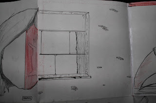
These are the photos from my digi-pak mock up design that I created a week ago. This is an average 6-panel digi-pak and so far this is the type of digi-pak that I think that I will possibly end up creating. It may end up being a digi-pak that exists visually or physically, so far I am not sure of this though.
The front cover- The front cover will, if my pan is consistent with the finished product, will have an image of Ruby Collins to establish her profile as an artist. It will also have a bonus but sticker as I feel that will make more potential buyers purchase the album as promotions attract an audience. On the front cover it will also have the conventional album cover and the name of the artist to establish product familiarity.
Back Panel- The back panel should have the track listing, as well a drawing of an old record payer as it will revive the old time; hopefully making the album have an almost retro feel. I also want some drawings or images of flowers on the back cover as I feel this will be in keeping with the inside panels that explore nature.
Inside three panels- The inside three panels are all cohesive and lead on from each other.
Panel one inside, starts the continuity as the drawing of the tree leads the branches onto panel 2 and then to the top of panel 3. There is once again conventions abided by. The first inside panel had a slot which fits a conventional booklet of the artist inside. I chose to apply this type of convention as it should be in a digi-pak as, it gives information on the connotations behind a single as well as information about the artist that would make the artist's fan base larger.
The second and third inside panels- These panels will hold two CD's. One of the CD's will be the actual album and the other will be a bonus extra CD that is an acoustic version of the first album. The reason and meaning behind this is because Ruby Collins excepts her routes and has integrity in the music world, she also encourages others to aim to be in the music world hence, allowing ready made artists to use her singles.
The opening panel to the inside three panels- The opening panel to the three inside panels will have a window on it, this is because I want this panel to reference the lyrics of the song. The fist line is "Three little birds sat on my window" thus, I will have a window that almost looks in the digipak


.As of yet I'm still reviewing the idea of trying to use Swiss graphics as I feel that it is quite clinical and possibly not organic enough for the type of artist that I am trying to portray.


.As of yet I'm still reviewing the idea of trying to use Swiss graphics as I feel that it is quite clinical and possibly not organic enough for the type of artist that I am trying to portray.


No comments:
Post a Comment